

We recommend that you familiarize yourselves with UI Customization Concepts before attempting to modify any components.
VeltSingleEditorModePanelWireframe
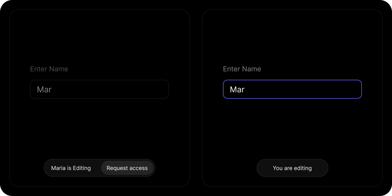
- React / Next.js
- Other Frameworks
ViewerText

- React / Next.js
- Other Frameworks
EditorText

- React / Next.js
- Other Frameworks
Countdown

- React / Next.js
- Other Frameworks
EditHere

- React / Next.js
- Other Frameworks
AcceptRequest

- React / Next.js
- Other Frameworks
RejectRequest

- React / Next.js
- Other Frameworks
RequestAccess

- React / Next.js
- Other Frameworks
CancelRequest

- React / Next.js
- Other Frameworks
Styling
Disable ShadowDOM
- By default, Shadow DOM is used to ensure that your app’s CSS does not interfere with the styling of the SDK components.
- Disable the shadow dom to apply your custom CSS to the component.
true
- React / Next.js
- Other Frameworks
Dark Mode
By default, all components are in Light Mode. Use this prop to enable Dark Mode. Default:false
- React / Next.js
- Other Frameworks
Variants
You can apply variants like you do for other components. You need to define variants using Wireframes. Read more here here.- React / Next.js
- Other Frameworks